Most of the time, the dining room does not take up a large space in one’s home because it merely consists of dining chairs and dining tables. Dining rooms, however, are essential because they are where we eat nutritious and delicious food.
Besides, it can also be an environment where family and friends can bond in the dining area through conversations or other activities. The dining area is often planned and decorated well, being a significant part of one’s home.
There are various color schemes that you can use in the dining room. The color of your dining room will vary based on your personal preferences and tastes. You can get whatever kind of dining area you like and pick from different color schemes for the dining room. You can even look at some curtain shops to match your favorite color of home decor and curtains. Amazingly, as long as you plan it smartly, whatever you pick will work well.
Colours You Can Match To Brighten Your Dining Area

Light and Dark Brown
Many would think that brown looks bland, but if you use it well by adding accents such as the animal print carpet, your dining room will look great. A coat of warm and beautiful brown paint will benefit from rustic-touch dining rooms
The Calm of the Blue
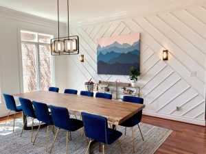
Love the blue one? This blue walled dining room would be the perfect place for you. Add some blue or even white furniture, and your dining room looks calm and peaceful.
You probably spend shorter amounts of time in your dining room than you will in other living rooms so that a color statement can really function in this room. Blue is exceptionally moody and rich and combines well with cool white accents.
Luxurious Gold and Silver

Gold has always looked elegant and glamorous, but gold makes it look like a queen’s dining room with an antique dining room. The dining room color scheme is the inner equivalent of a jewelry box filled with glowing precious pearls and metals with a brilliant combination of white, silver, and gold tones.
Black and White Combination
For the dining room, using white and black is a safe color. You can use it in your dinner collection or various areas of the dining room. A darkened dining room color palette can be as welcoming as a brighter dining room color palette, and with a few smart design moves, it can be used effectively.
Black is not to be feared, particularly when it comes to color combinations for dining rooms. Its tension and intimacy are ideal atmospheres for dinner parties, although its use in an occasional room makes it entirely livable.
Coral Orange
As you dine, orange can help keep you alert and is associated with warmth, security, comfort, and coziness. It’s perfect for building hospitality and a general relaxation environment for all and helps with food digestion. By adding beige or wooden highlights, you can even out the orange.
Sunny Yellow
Yellow inspires satisfaction, and happier individuals tend to eat more and consume their food more effectively. Yellow helps space feel more spacious and is connected to warm and joyful outdoor days. For the ultimate outdoors brought indoors, match muted yellow walls with fresh flowers and white highlights.
Green
Green encourages freshness, and since it gives a feeling of being close to nature, people often seem to be drawn to this color. Green dining rooms inspire balanced eating as well. However, as dirty green is not quite fitting, you should be careful what sort of green you choose for your dining room. Select a fresh shade of green instead, which makes the space look lighter and more extensive.
Earthy Tones
It will give your dining room a grounded setting, unpretentious atmosphere while still incorporating color and dimension. The soft green hue has heavy gray undertones and, at the same time, looks strangely misty. An open concept dining room gives a room a sense of peace and serenity and is a perfect color.
Turquoise
It is very hard not to compare blue with turquoise. It was shown that Blue decreased appetite and turned people away from food. On the other side, turquoise is a dazzling color connected with equality and rest. It is used in many restaurants on dishes and plates, especially on dessert plates, known as an appetite suppressant.
Rustic in Red
Red encourages liveliness and social engagement, as well as maintaining a cheerful and upbeat mood. You don’t have to choose a red that is too vivid, and maroons or red wine are perfect for creating an elegant dining atmosphere. The red walls and rustic sliding doors give the standard dining room a relaxed, country charm.
Neutral upholstered chairs and a gray-toned table can be chosen for the room, allowing the vibrant walls to serve as the focus of attention. Try looking at the upholstery of your chairs in a curtain shop.
New Neutral Pink and Green
When you want to keep your dining room walls neutral, gray and beige are not your only color choices. Blush pink can be used as a neutral background for bright green curtains. The combination of cool and warm hues gives significance to the room.
Final Thoughts
In the dining rooms we have included, have you seen your favorite color? If not, using the above samples as guides, you can always build it on your own. When handled badly, contrasting dining room color palettes can be a little overwhelming.
Still, when done right, with carefully selected color pairings, acceptable ratios, and plenty of neutrals to break up the color strength, their colors invigorate each other.
It’s a perfect time now to hit the retail world and look for the best curtains and home decor to match the color of your dining room.
Start shopping with Yorkshire Fabric Shop because this online curtain shop has a wide range of fabrics, home decor, and upholstery that every homeowner will love! Start planning your dining room area and match your home decor.